
We've had the Beta for K1000 v9.0 running on our environment for a few weeks, and thought I'd put down my thoughts now it's in general release (today, 20/8/18, it's here if you'd like to take a look!), as well as ask everyone else who's been running it what theirs are - it's possible those who don't use certain aspects I do will find this interesting, and I certainly would love to hear about other people's experiences with elements I don't use. Please comment below with what you're finding about stuff I've missed, or if you have any further questions about anything I've mentioned.
Also bear in mind this has been accrued across the Beta - my comments and issues may not reflect everything about the finished v.9 release as I've typed this before it comes out, and are also purely my opinion.
UI
Let's head this off with the most noticeable (and one of the most anticipated reading uservoice) changes - you can change the UI colours! :
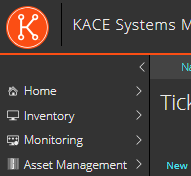
My eyes have never been more thankful - I had a good few users who moaned when it went a bit bright and migraine-inducing. You've now got the choice of three options, 'Light' (White like v.8), 'Dark' (above, which is a nice off-grey rather than full-bore black), and 'Hybrid' (which is a bit of both, like the old v.6 UI). You can set any of these as the default for all users, with individuals able to then go in and change their individual preference (which is remembered rather than having to be edited every time they log on - thank you Quest!)
We run the K2000 SDA too so actually got a preview of this change when we upgraded to K2000 v.6 - I'm speaking entirely theoretically here, but the way Quest release Kace, it seems the SDA is a bit of a testbed for changes to the SMA, so there's a possible heads up for you...
On a side note, other than simply being nicer on the eyes (white text on dark backdrop on a screen is always better), I think the dark grey/orange/blue colour scheme is actually rather snazzy and highlights important info well...
Service Desk
God bless pre-filled responses. No more impolite 'DONE' in a Resolution/Comment field from impatient techs. I've also found with the bulk of a message written, people are more inclined to take a couple of seconds and add technical details we may need later (We use a resolution field as a technical explanation of the issue for later Helpdesk reference, and comments for user interaction)
CC'd users being able to view and comment on tickets is a simple improvement but effective - makes getting people to approve/do leg work on tickets much easier. I'd still like to have a field to give CC'd users the ability to edit tickets they're CC'd in on. The only issue we bumped into here was when a typed email didn't match the user's email in the users section (case was our issue: Joe.Bloggs@company.com is not the same as joe.bloggs@company.com!). Being able to reply to an approval request email to approve or deny makes life easier too, especially for 'much too busy' people who are apparently so busy they stare constantly at their emails, you know the type.
Dashboards are nice and simple now with the new selection of widgets - select what you want and boom, instant dashboard. It's not extensive enough for everything you might want, but for a quick heads up, the large numbered counters for things like Overdue Tickets are great and take 30s (if that) to set up - as a bonus, you can click on them and they'll take you directly to the issue: i.e. you've got 6 overdue tickets on your dashboard, click the 6 and it'll take you directly to those 6 overdue tickets. Nice. I would like the dashboard to sit on an adjustably sized grid (so we can go more than 4 widgets wide on a wide-screen monitor or a window that's been zoomed out slightly), but I'd also like a holiday in the Seychelles and a new car...
Being able to put Downloads behind approval systems means we are going to be moving over to using that instead of getting users to raise tickets for software installs. We can shove our entire library of managed installations onto the Downloads section (behind user labels of course) and let the users ask for what they want with just a single approval needed rather than getting them to raise a ticket, have us process it, then apply the label for install, check in to ensure success, then fill out and close the ticket. Happy users and Happy Technicians.
Systems Management
Loads of good things here! Mostly related to the changes that have been made to the Agent, which makes it much more attractive as a tool for everyday work than previously (no offence <v.9.0 Agents, I still loved you)
Agents being a 'desktop application' (you get a little icon in your taskbar on Windows now)

has made life a lot easier for all involved. Users can tell if they're connected (and appreciate that happy green K as 'doing something'), and request an inventory. We can also troubleshoot Agent issues a lot quicker. A knock-on effect of the changes in the Agent has meant device actions are browser-agnostic ( a similar, non-official fix has been in existence for a while thanks to UntchV; https://www.itninja.com/blog/view/use-kace-k1000-device-actions-with-any-windows-browser, but this is the 'Official' version) K1000 sends the device action to your agent, instead of via an (always, to my mind at least, slightly dodgy) ActiveX control in IE. This means we now use device actions all the time (all our service desk techs use Chrome) instead of never like we used to. Being able to Teamviewer/VNC/load MMC consoles/file locations from the Management console in a couple of clicks streamlines the process a huge amount. We're going all in with our custom actions now to leverage this as much as possible. The only thing I'd like extra to this is for the device listed in a service desk ticket to have the device action button next to it so you can go into a ticket and resolve it from the same page, but again, holiday and new car...
Here's a bunch of smaller things which I've bundled together quickly:
1. WinRM/SSH Tunnels are something we're beginning to utilise, initially for simple WoL's, but we'll be attempting to use them to manage Agents on some of our multiple VLANS.
2. Introduction of Raspbian support is nice, as we have a bunch of Pi's running various screens and so on around the business, and we can now tie them into K1000.
3. We're a Dell shop now, but have a couple of older HP's and Lenovos knocking about - their (lack of) warranty data was picked up immediately once we'd added the API keys. Good job Kace.
4. Software License Harvesting - waiting for this to kick in, but it all looks good. You can also exclude software from being recognised as a 'license' so no more non-compliance warning for having no Powershell licenses...
5. Not messed about with the unified Task Schedule list too much, but you can essentially queue up things to happen in the correct order now - i.e. in the middle of the night, WoL a machine that's asleep, send out installations, patch those installations, patch the machine, run a script, then send it back to sleep when you're done. This unifies the 'send it and hope it hits in the right order' procedure that we've used previously - there were ways around this, but they were a bit ad-hoc. To have it built in from the ground up is muuuuch better.
From a personal note, it's good to see Quest taking some proper steps forward. If this is the kind of improvement we can see in a Major Version update from now on I'll be delighted.
I've probably missed a load of stuff, so would love to
hear from anyone else about their experiences with it.
EDIT:
I believe the new version of PHP bundled with the upgrade has made the Helpdesk display incorrectly for users in our environment using IE 9 or earlier. I don't say this as a warning, or raise it as an issue, because nobody should still be using IE9, BUT if like us you have an ERP system dependent on IE to function, then you might have the odd user with it - so it might be something to be aware of.

Comments